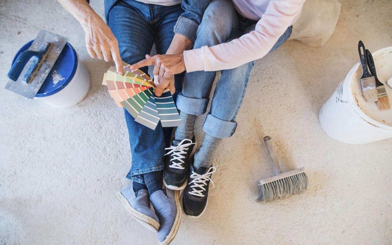
Choosing the right paint color isn’t just about personal preference; it’s about creating a feeling, enhancing the architecture, and making every room in your home feel intentional and well-designed. From calming hues to energizing tones, color impacts the way you experience your space.
The science of color takes into account more than trends; it relies on psychology, natural light, and how each tone interacts with its surroundings. If you’ve ever stood in front of a paint swatch wall feeling overwhelmed by the choices, you’re not alone. This guide will help you make confident, informed decisions about paint tones that bring out the best in every room.
Understand The Psychology Behind Color
Color has a profound effect on your mood and behavior. That’s why understanding color psychology is a powerful first step before you choose a single swatch.
For example, blue is often linked with calm, stability, and productivity, making it a top choice for bedrooms and offices. Green promotes balance and relaxation, while yellow adds cheerfulness and energy, which can be ideal in kitchens or breakfast nooks. On the flip side, red increases energy and can even stimulate appetite, which is why it's frequently used in dining rooms. Neutrals like gray, beige, and white create a clean, versatile backdrop — ideal if you want flexibility in styling. By choosing colors based on how you want to feel in a room, you can set the foundation for harmony and comfort.
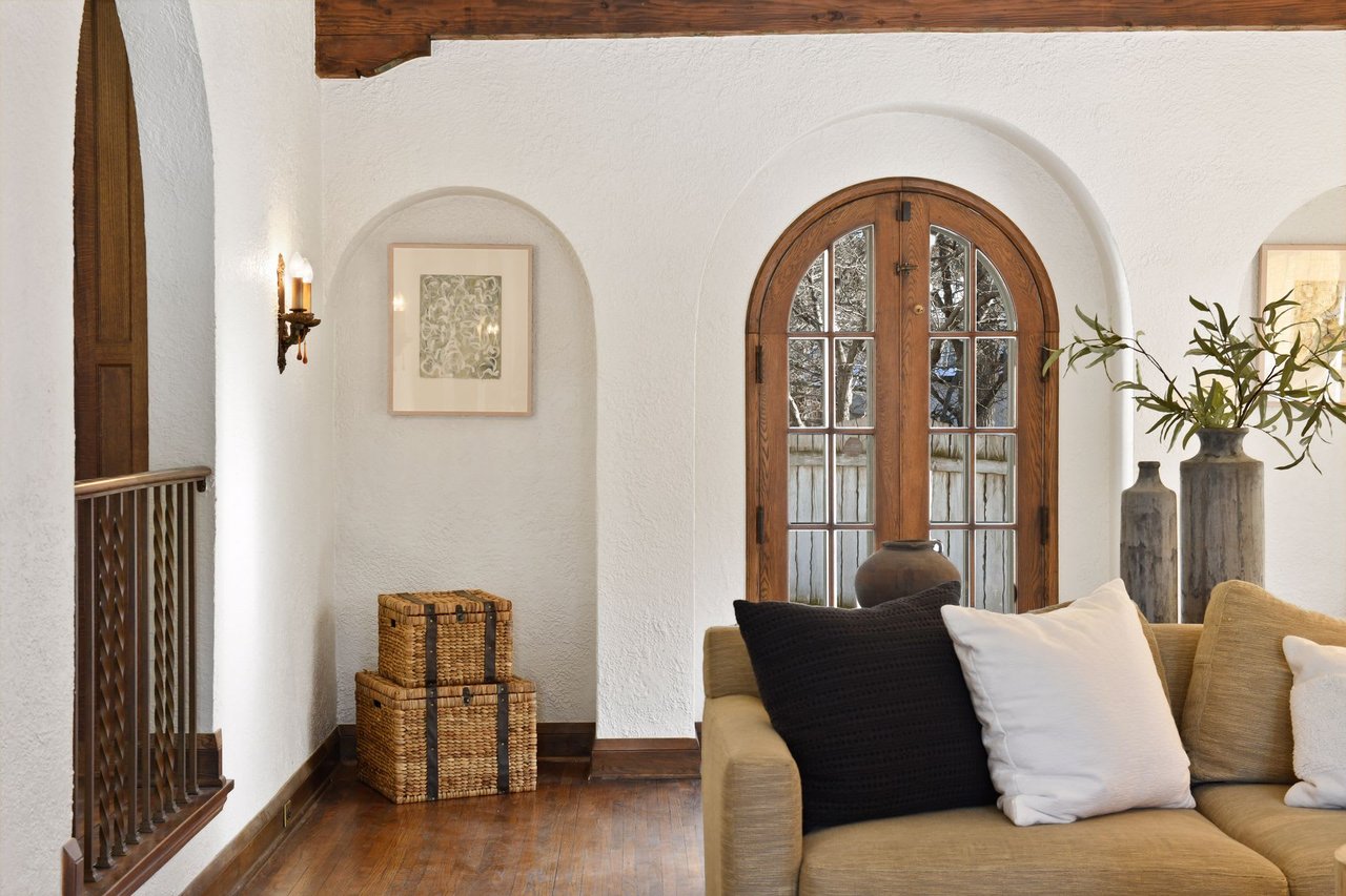
Consider Each Room’s Purpose
The function of each room should directly influence your paint decisions. Think about how you spend time in each space, and let that guide your palette. A bedroom should feel restful, so soft, cool tones often work best — think muted greens, dusty blues, or creamy taupes. Living rooms, where you gather and entertain, tend to benefit from warmer tones that feel welcoming without being overpowering.
Bathrooms often shine in light, spa-inspired shades like soft grays, pale blues, or pastel greens. If you have a home office, incorporate tones that promote focus and clarity. Deep green, slate blue, or warm beige can help you stay productive without feeling overstimulated.
Evaluate Lighting Conditions
Natural and artificial light dramatically impact how paint colors look on your walls. The same shade can appear entirely different from one room to the next, depending on how much sunlight the space receives and the direction the room faces. North-facing rooms often have cooler light, making colors appear slightly darker or grayer. In contrast, south-facing rooms receive warm, bright light that enhances warm tones.
For east-facing rooms with morning light, consider soft yellows, pale pinks, or warm neutrals to complement the brightness. West-facing spaces benefit from cooler shades that balance the warmer afternoon glow. Always test your chosen paint colors on multiple walls and observe them at different times of day before committing.
Choose A Cohesive Color Flow
A well-coordinated home feels seamless from room to room. While each space can have its own personality, there should be a sense of cohesion throughout. Achieve this by selecting a consistent undertone — for example, warm undertones for every shade or cool undertones for a more modern palette. This approach allows you to mix and match colors without clashing.
Another effective strategy is using different tones of the same color group. Soft sage in the bedroom, deep olive in the office, and a fresh mint in the bathroom all maintain a thread of green while still giving each room a distinct identity. Repeating accent colors, like trim or ceiling shades, can tie your entire home together visually.
Use Neutrals As Anchors
Neutrals aren’t boring; they’re essential. Think of them as the base layers in a wardrobe. Whites, grays, beiges, and creams create breathing room and highlight your furniture, artwork, and architectural features. When used thoughtfully, neutrals bring balance to bold hues and prevent spaces from feeling overwhelming.
That doesn’t mean you’re limited to plain white. You can find warm or cool neutrals with subtle undertones that support the mood you want to create. Soft beige, ivory, or pale almond shades offer warmth, while icy gray or dove white adds a crisp, clean backdrop. These tones work especially well in transitional spaces like hallways, entryways, and stairwells.
Highlight Architectural Details With Accent Colors
A strategic use of color can draw attention to the most compelling parts of your home. If you have crown molding, tray ceilings, built-in bookshelves, or arched doorways, consider using paint to make these features stand out. A darker hue on wainscoting can ground a room, while a contrasting trim color can give even a small space more dimension.
You don’t need bright, flashy colors to make an impact. A charcoal fireplace or a navy accent wall can create a focal point without overwhelming the space. Use accent colors to guide the eye and enhance the character of the room.
Balance Bold Tones With Restraint
Bold colors can energize and personalize your home, but they require careful placement to avoid overpowering a space. If you’re drawn to rich navy, emerald green, mustard yellow, or deep burgundy, think about using them in smaller doses — such as an accent wall, a powder room, or cabinetry.
Balance is key. If you choose a deep hue for one wall, keep the surrounding tones light and neutral to let it breathe, or pair a dramatic color with lots of natural textures and soft textiles to soften the effect. Bold colors can feel sophisticated and fresh when integrated with thoughtful design choices.
Factor In Flooring And Furnishings
Paint doesn’t exist in a vacuum — it interacts with everything else in the room. Your flooring, cabinetry, countertops, and major furniture pieces should all influence your color decisions. If you have cool-toned gray wood floors, lean toward colors with similar undertones. If your kitchen features warm wood cabinetry, pair it with complementary shades like warm white, beige, or earthy green.
Bring fabric swatches, tile samples, or photos of your furnishings when choosing paint to make sure everything coordinates. Creating a mini mood board can help you visualize the final look and avoid mismatched tones that disrupt the flow of your design.
Let Color Shape Your Space With Purpose
Color is more than a finishing touch — it’s one of the most powerful tools you have to influence how your home feels, functions, and flows. When you understand the science of color and apply it to your space, you create a home that feels balanced, beautiful, and unmistakably yours.
Connect with the
Cari Ann Carter Group when you’re ready to explore your real estate options in Edina, MN, and find the perfect match.